

I recently did a Science lesson for our topic ‘healthy bodies’ in which my class measured their heart rates before and after different exercises. Click here to find out about it. After, the students used the App ‘MyGraph’ to create charts of their results (find it for free on the App Store).

How do I use the App?
It’s very straightforward to create graphs.
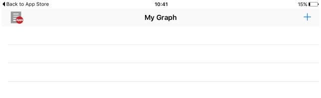
1) Open the App and tap the + in the top right corner.
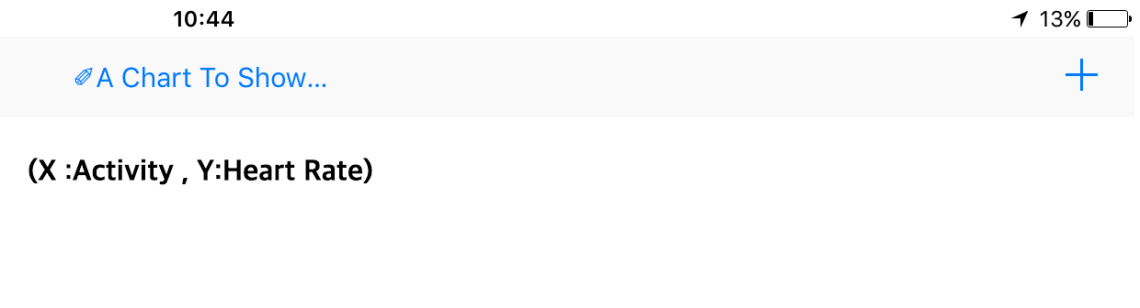
2) Next, choose the graph type, add a title and then label the X and Y axis. You can also add units if you wish and change the colours.

3) Click on your chart title and then again click the plus symbol.
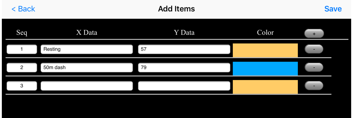
4) This time, you can add your data. Press the grey plus button and add your X and Y values. Here you can change the colour of each bar too.
5) Finally, when you have saved, the chart will be instantly created!

For more information, have a look at my video tutorial:
Have a go at using the App – let me know how you get on by commenting below.

