
Students in Coach Cole Wallace’s eighth grade world history class in Talladega County, Alabama, made him do pushups one week in February for saying his catchphrase—“Come on, guys”—too many times.

Coach Wallace helps a student working with Net.Create
This wasn’t a failed classroom-management plan, though. It was democracy at work. Across five world history classes, Coach Wallace’s students used a network diagram to propose, and vote on, new classroom rules as part of a learning experience about democracy in Ancient Greece. Students began by creating “rules” they’d like to have in class as nodes or circles in the network, and then connecting their names to the ones they wanted to vote for. Initially, all of the student votes were represented in the network, but as the activity progressed, students were randomly assigned Athenian voting eligibility requirements: male, citizen, landowner. Coach Wallace filtered, or used a software feature to remove votes from students whose random characteristics didn’t meet Athenian requirements so that the class could see how important each individual vote was, and what happened to their new classroom rules when only the votes that counted in Ancient Greece were left. This meant that students first saw the rules they had all voted for. Then, half of the students (those who were not citizens) suddenly faded out, and their votes no longer counted, shifting the final result. This was a powerful moment that helped the students see the impact of different kinds of status on voting in both Ancient Greece and the modern world.
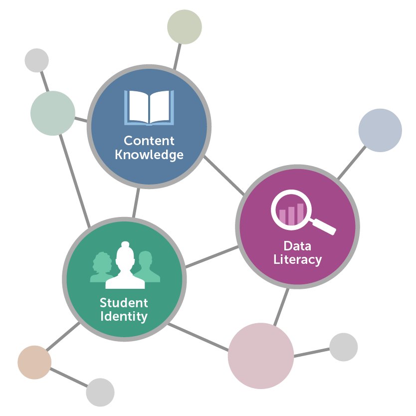
This lesson was part of a partnership between Digital Promise, Indiana University, and Talladega County Schools to explore how data visualization tools can build data literacy skills and content knowledge while also connecting to students’ interests.
Data visualizations are ways of representing information that help make features of the data more salient. Carefully chosen data visualizations can heighten student engagement in learning by incorporating student interests, content knowledge, and data literacy in meaningful ways.
While Coach Wallace had taught this lesson without network diagrams before, the introduction of a data visualization tool called Net.Create let students visualize and interact with the voting results more easily. A network diagram is a series of nodes (circles) and edges (lines that connect the nodes). Nodes get larger based on the number and weight (importance) of connections with other nodes. By using filters within Net.Create to show the diagram based on the assigned characteristics, students could see how the outcomes of voting changed when only a few individuals could vote. This lesson stuck. At the end of the unit when Coach Wallace was reviewing Athenian democracy, a student spoke up, “Coach, I got this.”
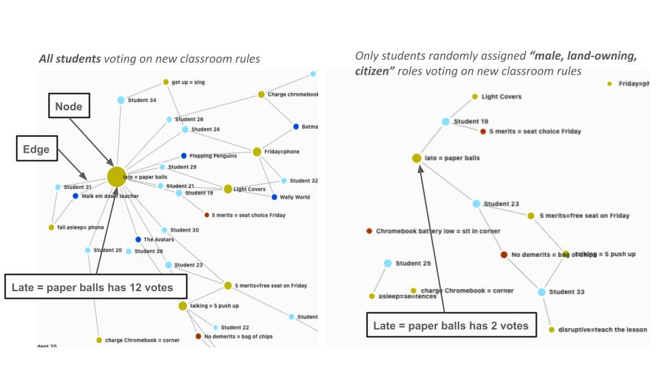
A comparison of a Net.Create network diagram of student votes. The diagram on the left shows all students voting on the new classroom rules while the diagram on the right shows only students who were randomly assigned “male, land-owning, citizen” roles voting on the rules.
Incorporating student interest was a key part of this lesson. Students were invested in this lesson because the laws they were proposing were based on their own interests and ideas and would actually be enacted in class. This personalization was key in how the students interacted with Net.Create. “The biggest benefit to teachers, outside of the content itself, is the identity and the connection to the students” says Coach Wallace. “You can learn a lot about your students doing this. I learned a lot about what students thought was interesting, what students like to do in class, what they don’t like to do.” Coach Wallace found student engagement in this lesson was high because students could express their interests and identities while engaging with the content and gaining data literacy skills.
Being able to understand and analyze different ways data can be represented is considered an essential skill in our increasingly data-saturated world. Coach Wallace noticed that students responded to the visual nature of “data” and actively engaged with the data, even manipulating the representations to make it represent how they saw the relationship among different data points. “They started to realize how to make the data look more like how they thought.” In addition to seeing how students responded to the visual nature of the network, Coach Wallace saw network diagrams as a meaningful way to explore themes in history, “because the world is connected in so many different ways. There are relationships between leaders. There’s relationships between countries.”
Coach Wallace is excited to try more lessons using Net.Create and plans to ask students to build data visualizations that demonstrate connections about historical leaders and events and incorporate students’ interests and identities. “There’s no telling what you could learn from a student.”
What to consider when using data visualizations with students:
Interested in trying this in your classroom? Net.Create is currently still under development—sign up to be notified when it becomes available. In the meantime, data visualizations can be developed using free tools you may already have access to, such as Google Sheets, Microsoft Excel, Canva, Tableau, Tagxedo, Google Draw or Miro.