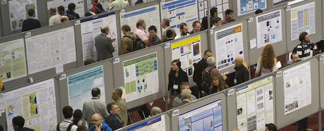
Scholars around the world share their latest research findings with a decidedly low-tech ritual: printing a 48-inch by 36-inch poster densely packed with charts and graphs, and accompanied by blocks of text describing their research hypothesis, methods and findings. Then they stand in an exhibit hall for an hour, surrounded by rows of other researchers presenting similar posters, while hundreds of colleagues from around the world walk by trying to skim the displays.
Mike Morrison, a PhD student in psychology at Michigan State University, says the experience turns out to be highly dispiriting.
“It’s like standing at a bar or a club and waiting for someone to talk to you—you’re thinking, ‘am I not pretty?’” he said in an interview this week. Often the people browsing the posters avoid eye contact, so they can keep scanning the titles of the posters until they find one that seems related to their own work.
Not only does the exercise deflate the morale of the scholars sharing posters, but the ritual is also incredibly inefficient at communicating science, Morrison argues. And the stakes are high, since the posters could potentially connect scholars to findings or approaches that could help them speed up their own discoveries to, say, cure a disease faster. “It’s not just frustration that’s on the line, it’s human progress itself,” he says.
Morrison says he has a solution: A better design for those posters, plus a dash of tech.

Specifically, he created a poster template that skips the dense academic title of the project and replaces it with the main research finding, stated in plain English and printed in a giant font that can be read clearly even from several feet away. The design still includes a few charts and bullet points about the methods, but there’s also plenty of empty space. It looks eye-catching, if a bit incomplete.
To make up for all the nuance and detail lost in this approach, the template includes a QR code that viewers can scan to get to the full research paper.
Before Morrison decided to go back to grad school to get his PhD, he spent more than a decade as a web designer who specialized in user experience. Which is why the cluttered and hard-to-read layout of the standard templates used for posters struck him as particularly egregious.

And he’s had his own bad experience with the traditional poster design. He remembers presenting his first research poster in 2017 at the Association for Psychological Science’s annual conference in Boston. Despite his eagerness, few people stopped to talk to him.
Ironically, he was presenting research on what makes work meaningful to people. “One of the quickest ways of making work meaningless is doing something that’s futile,” he says, which is what it feels like to stand by a poster no wants to talk about. “It’s almost like you’d have a better experience if you had 50 people yelling at you and saying it’s a bad paper,” he joked (since if people criticize you they likely, at least, have read your work).
Morrison decided to share his template with the world, and he wanted to do so in a way that would make his method the new norm. If everyone followed his lead, he argues, researchers could rethink how they experience poster sessions.
The current model lets scholars deeply explore two or three papers during a typical hour-long session, since the dense poster design requires the reader to stand at one display for a long time to take in all the information. The new design could give scholars the chance to quickly scan all the major findings presented in the room, and leave time to have more conversations with presenters about the related work.
So Morrison designed a splashy social-media rollout of his template. He spent a year—in his spare time on nights and weekends—producing a 20-minute animated video explaining the problem with research posters and why people should try his idea. In March, he posted the video on YouTube, with a link underneath pointing to a webpage where anyone can download his poster template. Then he sent out a tweet with the video link.
“Let’s fix academic posters!” it began. “Watch this cartoon to see a new, faster approach to designing research posters. Includes templates. #betterposter.”
Since then the tweet, and the video, have gone viral, with more than 3,000 retweets and 200,000 video views.
Just weeks after he released his design, a researcher in Canada became one of the first to try it out.
Eugene Ofosu, a social psychology graduate student at McGill University, presented a research poster at the 2019 Mental Health and Law Conference using Morrison’s template. And he won first place in the poster competition.
Poster Credit: @mikemorrison https://t.co/SKj8NOl0jQ
— Eugene Ofosu (@OfosuEugene) March 30, 2019
Dumbing Down Science?
The new design has some critics, though.
In Twitter and YouTube comments, some researchers said Morrison was dumbing down the science and missing the point of poster presentations, which they say is to show all the work on the board so that peers can have a conversation at the conference about all the fine points.
“They said, ‘You’re turning science into a meme,” said Morrison.
Morrison sees it as a compliment. “Memes by design spread,” he said. “Don’t we want science to spread?”
Use of the template appears to be spreading from discipline to discipline with each new conference.
A blog about the design of scientific posters (yes, there are blogs devoted to this) offered some detailed suggestions for small modifications to the design. Morrison has already incorporated some of those changes in a new version of template. In fact, he has been releasing new updates frequently, as if the template was a piece of software needing regular improvements.
But not everyone using Morrison’s template is following his directive to keep the text short.
Some examples researchers have tweeted out using the #betterposter hashtag show posters with QR codes but still densely packed with text.
Rankyung Hong, a PhD student in computer science at the University of Minnestoa, said the new design is probably “more ideal” than the traditional template. But she admits she will probably continue to fill all the available space on her research posters with findings and detail about her research. “It’s very complicated material,” she says of her research. Plus, she says, presenting as much information as possible is “the norm in our department.”
But she will consider adopting at least some of Morrison’s ideas, like using the QR code to send people to the full paper. “I think it’s cool,” she says. “It’d get very good attention from the audience because it’s a different style.”

