The sweep of the coronavirus across the U.S. has produced an information paradox. News reports—and rumors—about the pandemic are inescapable. Yet without a coordinated national response to the crisis, reliable data that could help inform policy is scarce.
School leaders trying to make decisions about whether and how to reopen physical classrooms this fall are feeling the absence of useful statistics acutely. So too are parents wondering whether to send their kids to school in person, if and when they have that option.
They’re not getting health and safety data from the government agencies that might be best positioned to collect and publish it. The Centers for Disease Control and Prevention isn’t tracking COVID-19 cases associated with K-12 schools. Neither is the federal Department of Education. Some states are collecting data but aren’t necessarily sharing it publicly.
So educators are tackling that homework themselves. Some have national ambitions, like the teacher in Kansas counting cases of COVID-19 in schools across the country. Others have a regional scope, like the teachers union in Texas tallying cases across the state.
A new effort aims to take these homegrown research projects a step further. Called the COVID-19 School Response Dashboard, it asks elementary and secondary schools and districts throughout the U.S. to report confirmed and suspected cases of COVID-19 among their students and staff who are learning and teaching in person this fall. It’s a collaboration among an economics professor at Brown University, Qualtrics, the National Association of Elementary School Principals and the National Association of Secondary School Principals.
Instead of simply counting cases without context, this crowdsourced drive for better data aims to calculate rates of infection—that is, the number of cases divided by the total number of students and staff in attendance. That’s because if a school reports 10 cases, it makes a big difference whether that’s among 25 children or 125,000 children, says Emily Oster, a professor of economics at Brown who is organizing the dashboard effort.
“Without that baseline understanding of the numbers, it’s difficult to evaluate the risk, which is where we should be making decisions,” she explains.
The dashboard displays that data at a national and state level, which may prove useful to national and state officials. But it doesn’t show more local or school-specific case rates. That means school leaders and parents trying to make sense of infection rates in their neighborhoods will have to seek information elsewhere.
“Schools are hungry for practical, actionable guidance. Sometimes state data is not getting to the level of granularity they need,” says Miho S. Kubagawa, partner at NewSchools Venture Fund, a nonprofit that invests in education leaders and entrepreneurs.
She says that craving for a localized approach was evident at a recent webinar that NewSchools Venture Fund hosted for school leaders. More than 100 showed up to hear guest speaker Emily Kim, founder and CEO of Zeta Charter Schools in New York City, explain how developing her own community-focused data dashboard gave her the confidence to invite students back into classrooms at the end of August—a whole month before most of the city’s other public schools started to reopen.
“We need ZIP code-level data, not national data,” Kim told EdSurge in an interview. “The data we need is absolutely local.”
A Call for National Data Collection
In addition to asking schools and districts to submit data every two weeks about confirmed and suspected COVID cases, the new national dashboard also asks for information about the strategies schools are using to prevent infections, the learning models they’re offering and whether families had a choice about how their students could learn this fall.
Collecting those details is an effort to “replicate what we think should have been happening at the overall government level,” Oster says.
The dashboard debuted to the public on September 23 with data from more than 700 schools, including 131,000 students and 48,000 staff attending school in person on an average day (since some schools are using hybrid models that allow students in the classroom only a few times a week). As of September 30, confirmed infection rates were 0.137 percent for students and 0.23 percent for staff.
Oster explained how to interpret those numbers in a recent opinion article in the New York Times, when the dashboard reported case rates of 0.073 percent for students and 0.14 percent for staff. That meant, she wrote, that “in a school of 1,350 students you’d expect one case every two weeks and, in a staff of 100, one case about every 14 weeks.” Including suspected cases in the tallying would make those figures three times as high, she added.
Eventually, the dashboard may help researchers assess whether policies intended to prevent virus transmission, such as requiring students to wear masks or attend class primarily outdoors, are working. For example, early analysis suggests that limiting group sizes to less than 25 is the mitigation practice linked most strongly with low infection rates. More early findings are explored here.
One metric the dashboard won’t track: student and staff member deaths from the coronavirus. That information should be recorded by county health departments, Oster said during a webinar about the dashboard on the day it launched.
The new tool has limitations. It draws on self-reported data, which isn’t always reliable. Parents aren’t necessarily telling schools when students are sick—and in some cases, they are actively undermining COVID case reporting protocols. Schools and districts may decide not to share their data with the dashboard, or may not even know they have the option to participate. And the dashboard will not help students and families see what’s happening at their particular schools.
Oster acknowledges that the system is not perfect. But she thinks it will help policymakers and schools make better decisions than they might have made without the dashboard. It would be ideal to have universal testing in schools, she commented via chat during the presentation, “but we are far from that (unfortunately).”
“That all of the best sources of data on this are run by ladies with other jobs is really a pretty depressing fact,” Oster told EdSurge in an interview.
School Leaders Look to Local Data
A nationwide dashboard is a good idea, says Kim of Zeta Charter Schools—although one that would have been more helpful over the summer.
“What should have happened was an immensely coordinated national response to lead the way and give very clear information, direction, guidance, that then the localities could follow and translate it to their specific locations,” she says.
When Kim realized that response wasn’t coming, she made it her mission to learn all she could about how COVID was spreading locally, in the communities where Zeta students live. Her goal was to reopen her schools as soon as she determined it was safe to do so, she says, “because it’s better for kids.” And it’s what many Zeta families said they wanted when the school surveyed them.
“It was very important we figured it out for ourselves to the best of our ability,” Kim says.
That’s an option not all educators have had during the pandemic, though. Unlike leaders at many district schools, those at some charter schools “can make decisions without necessarily having to get approval from a larger entity,” Kubagawa says. “There may be an ability to be more nimble.”
Kim talked with medical and public health experts and learned how to interpret testing and disease transmission rates in the parts of the city where her schools are. The data she uses comes from state and city officials, but because some of that information is published at a delay, she also turns to figures collected through volunteer-led efforts such as Rt.live, which was created by the co-founders of Instagram using data from the COVID Tracking Project, which is led by journalists who write for The Atlantic.
“We need the experts to funnel information to us in real time,” Kim says.
Educators Teach Each Other
Until that happens, school leaders are turning to each other for guidance about how to reopen schools safely. In the absence of clear data, they’re seeking examples of the experiments other institutions are trying for managing lunchtime, transportation and communication with families.
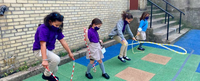
Because blog posts about Zeta’s reopening process attracted a lot of interest, Kim asked NewSchools Venture Fund to help her organize a webinar to explain her strategies to other school leaders. Photos and videos she shared of pandemic-era Zeta classrooms and schoolyards showed students wearing masks while sitting at desks spaced far apart and jumping rope in designated spaces.

The presentation was useful for participant Justin Lessek, founding executive director of The Sojourner Truth School, a public charter school in Washington D.C. that launched this fall.
“There are a lot of little practices where it helps to see what schools like Zeta are doing,” he says. For example, Lessek called Zeta’s use of structured play activities during recess a “great idea” for helping students stay distanced while still having fun.
But anecdotes about how schools across the country are managing to reopen are helpful only to a point, Lessek adds. Practices that work in some places don’t always translate elsewhere.
“Just because it’s within guidelines to do that within this other state doesn’t mean it’s within guidelines here,” Lessek says. “Early on, we were trying to parse out all these different examples—this school in San Antonio is doing this, this school in New Jersey is doing that. We got this recommendation—and it seems like a great idea—this school in California might be doing, but we literally might not be able to do that because of the rules in D.C.”
For making decisions about opening his own physical classrooms, Lessek has looked mostly to local guidance from the D.C. public charter school board, city officials and other school leaders in his area. He says some of the most important data he’s received has been hyper-local: results from surveys of staff, students and families about their needs and desires.
Based on this research, leaders at The Sojourner Truth School decided they could start the fall by offering in-classroom learning to only 20 out of their 92 students—ideally the ones who needed that option most. After explaining this, leaders asked families to express whether they thought their students should attend school in person.
Tidy figures and clear outcomes have been hard for schools to come by this year. But these calculations came out clean.
Family requests for in-person learning matched the capacity set by school officials, Lessek says: “We ended up with almost the exact number we were hoping for."

