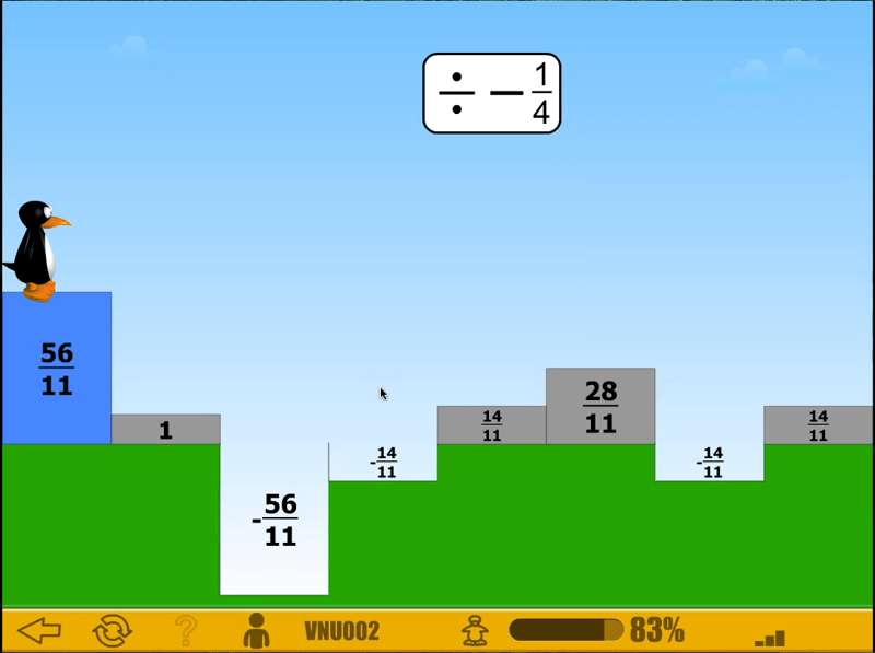
My design teammates and I have learned a lot by clicking around and using ST Math ourselves. Just like a student would, I’ve experienced the productive struggle that comes about when the math is apparent, but I can’t figure out what the puzzle is asking me to do. I’ve also experienced how frustrating it is to be at 83% on a level, misclick, lose my last JiJi life, and have to start over again.
Logged in on my teacher account, I too have gotten frustrated trying to triple-click using a temperamental touchpad.
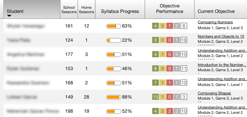
The first time I encountered the stop-light-colored bars, with various numbers, on the progress report, I asked our support team how to interpret them because I didn’t remember it from my initial product training.
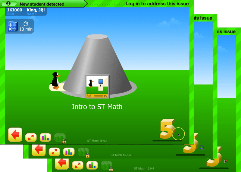
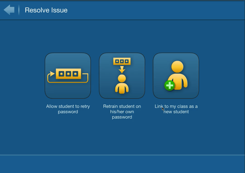
I’ve tried (and failed) to link a student who unknowingly exited-out before their linking to my class was completed.
These trouble spots end up in our design discussions. We first determine how a proposed change might align (or not) with our core values and our mission.
Then we evaluate the severity of each issue and consider the cost of allocating design and development time to make the proposed change immediately versus addressing it in a bigger redesign effort later on.
This past school year we began conducting in-depth user experience research and usability studies leading into our next big redesign, due out in a couple of years.
From October to mid-April we spent time in classrooms observing students using ST Math and asking for their candid feedback. In the process, we taught them a little bit about constructive feedback…teaching them to tell what they did or didn’t like about something, and why it did or didn’t work for them.
We also taught students how our user experience design team doesn’t just hand design ideas over to engineering to code. Rather we use feedback to inform our design, then return for even more feedback, repeating the cycle multiple times before deciding upon a final design.
For example, in response to student feedback on the overall look and feel, we started with a handful of games and tested multiple successive design versions, before we landed on a design idea that worked for students:
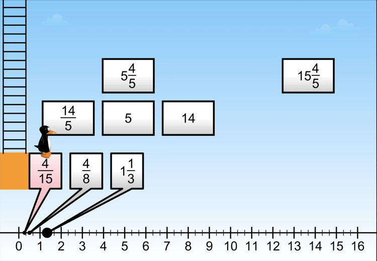
1. This example shows the original look and feel that many students find repetitive. There’s also a math consideration: this number line doesn’t segment to 15ths, the smallest listed fraction, and was confusing to some students.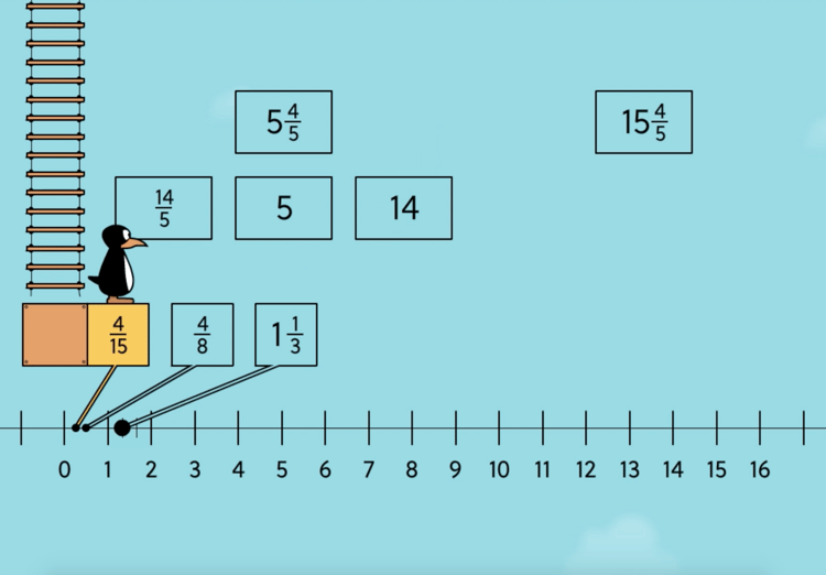
2. In this first iteration, students thought the simplified visuals and number line looked too basic, and felt like an older version of the original. Students with vision challenges found it difficult to identify the blocks on the same colored sky background. 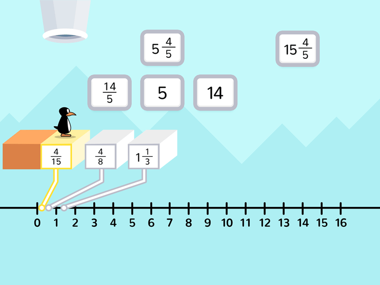
3. The next version brought more color and texture, but proved to be confusing for students who gave the 3D steps a mathematical significance. Seasoned ST Math students expect game elements to be intentional and mathematically accurate. Many of these same students also felt the colors were meant for younger grades. 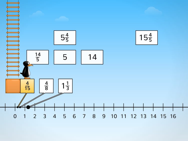
4. Because we were getting so much feedback that the colors were “too young,” the fourth iteration revisited the original color scheme, but the overall design was too close to the present version and didn’t feel new. 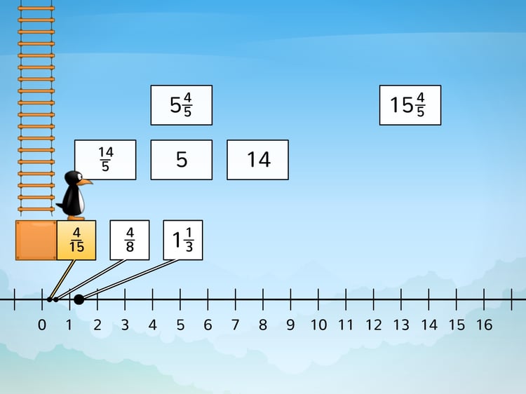
5. In the latest iteration, the bolder numbers and background with more depth elicited positive responses from students who felt like it was a place they’d like to visit.
That’s just one example of the feedback and iteration process for one particular game. This latest version may not yet be final, because each change carries a ripple effect. A design style that works for one game might affect the mathematical integrity of another. It’s a very careful and extensive process.
In addition to game screens, we’ve been conducting usability tests with students on design ideas for an updated toolbar.
These usability tests help us determine whether the designed elements are easily understood, intuitive, and easy to find. We learned that students often think a “share” icon, often found in modern web design, looks like “dancing lollipops.” Sometimes elements designers believe are common don’t automatically resonate with the user. 
We certainly found this to be true when we shifted gears from focusing on the student experience to the teacher experience.
On the first day of usability testing a low-fidelity prototype we learned that an “i” in a blue circle is not as intuitive as we expected! Teachers had difficulty locating it, or recognizing it in the context of their report pages.
However, we also learned that once we pointed it out in the context of their reports, teachers then associated the icon to other programs or websites where they’ve seen it, and recognized that clicking that “i" takes them directly to information about the adjacent design element or function.
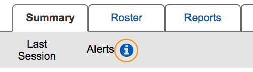
Using a low-fi prototype we were able to understand that this design element needed to be made clear in this context for the users.
Low-fidelity prototypes, which consist of simple buttons, text and content placeholders instead of high-fidelity graphics, are faster to create so we can return to the field for testing with each iteration. The best thing about low-fi prototypes is that people are more comfortable offering candid feedback on work that is not yet pixel-perfect.
A Continuous Process
Alesha Arp is a senior user experience researcher at MIND Research Institute. When she’s not uncovering ways to improve experiences—at work, or IRL—she can often be found baking for family and friends. Homemade cakes are her specialty.


.png)

Comment